

Summary
· The capital inflow into Bitcoin remains positive, although the inflow scale has decreased since it first reached $100,000. This highlights a period where the selling pressure is decreasing as the market approaches short-term equilibrium.
· The selling pressure from long-term investors has also decreased, and the amount deposited on exchanges for sale has also decreased.
· Several volatility indicators are tightening, with the market trading price within a historically narrower 60-day price range, which usually indicates that the market is almost ready to fluctuate again.
Capital Flows Approaching Balance
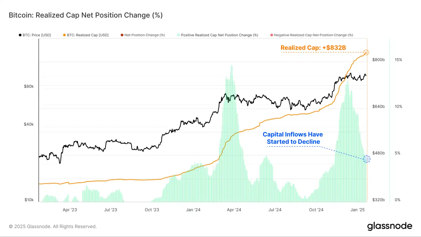
As the price reached the $100,000 level, the net capital inflow into Bitcoin surged, indicating that investors are locking in significant profits. As the market consolidates and adapts to the new price range, these capital inflows have begun to decline.
The slowdown in profit-taking represents a net reduction in selling pressure, so less new capital is needed to maintain the trading range.
Currently, the trading price of the actual market value is $832 billion, growing at a rate of $38.6 billion per month.
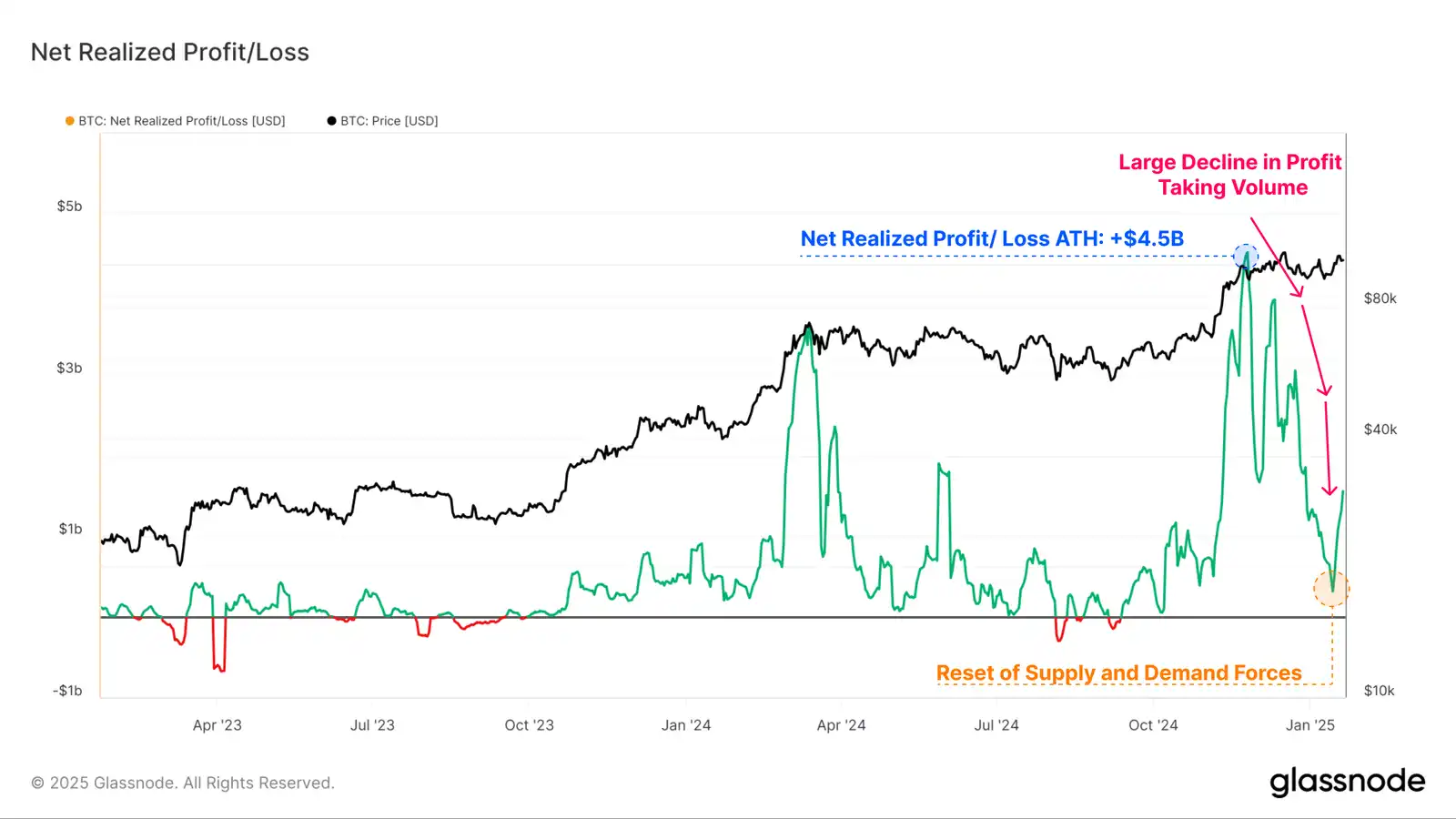
The Realized Profit/Loss metric is the first derivative of the realized market value, allowing us to discretely observe the scale of on-chain net capital flows denominated in US dollars.
As the market digests the distribution of profit-taking pressure, the balance between realized profits and losses is gradually trending towards a neutral position. This indicates that the supply and demand forces are resetting, and most of the tokens currently being traded have not locked in a large value increment relative to their initial acquisition price.
The profit-taking volume peaked at +$4.5 billion in December 2024 and has now decreased to +$316.7 million (-93%).
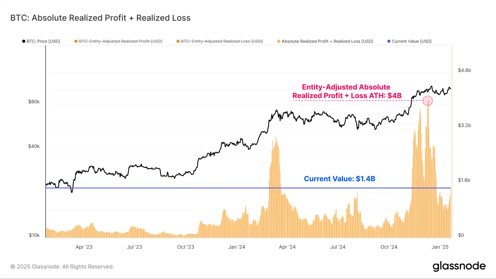
The absolute volume of Realized Profits and Realized Losses (after entity adjustment) is another set of tools that can help us measure the direction and sentiment of capital flowing in and out of Bitcoin.
When we add the Realized Profits and Losses together, we can see that this composite metric has plummeted from a peak of $4 billion to a value of $1.4 billion. Although it has decreased by 65%, from a historical perspective, the current value is still very high, highlighting the scale of daily demand to absorb this capital during the bull market.
Supply Slowdown
We have determined that the overall selling pressure has clearly decreased. We can further study these dynamics using indicators like Coinday Destruction and exchange inflows to confirm this view.
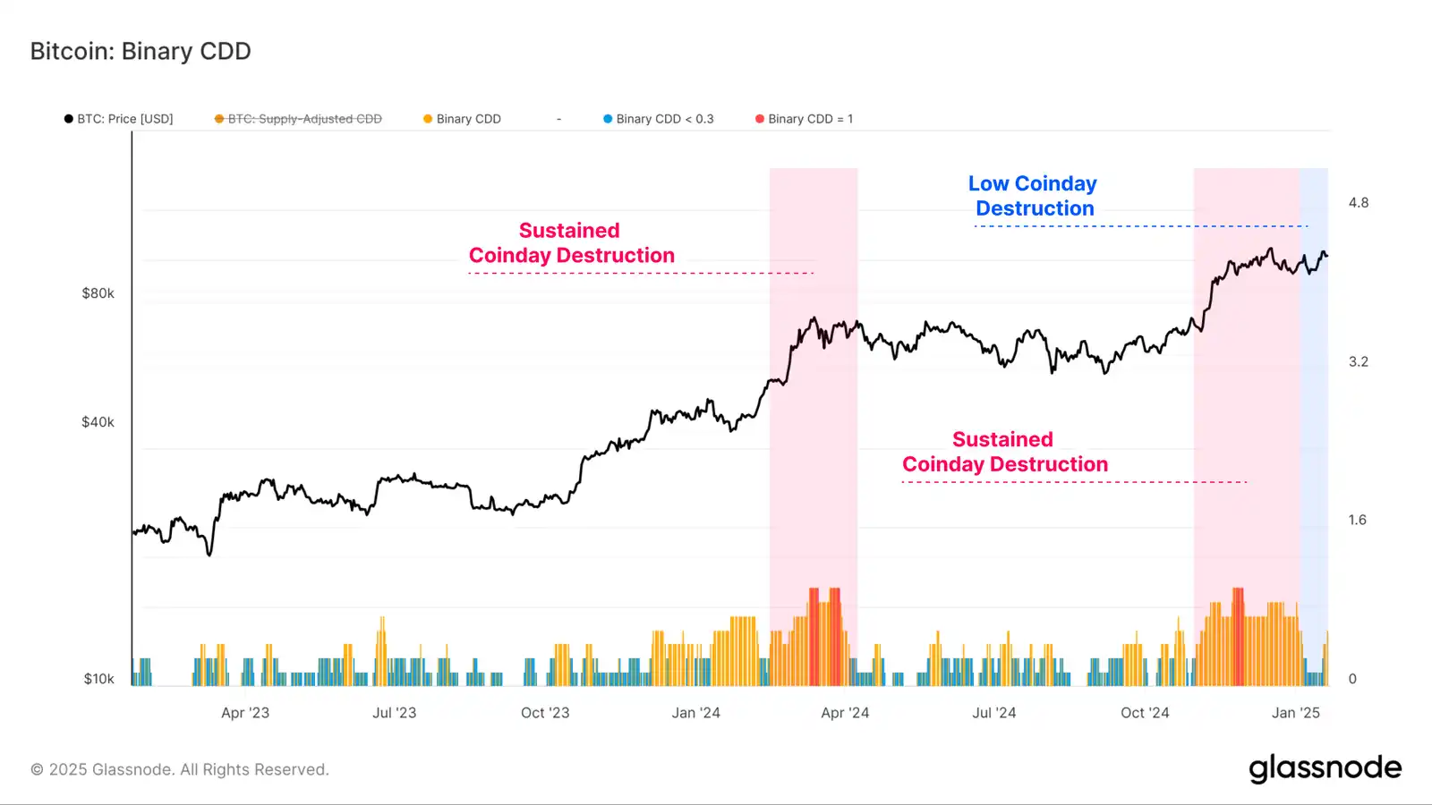
The first tool we can use to better describe the distribution pressure of investors is the Binary CDD metric. This metric tracks the "holding time" spending of the entire market, tracking when older supply holders trade increasingly larger quantities.
We saw a sustained period of severe coinday destruction in late 2024 and early 2025. In recent weeks, as relatively lighter coinday destruction has dominated, this indicator has started to cool down.
This suggests that a large number of investors planning to take profits may have already done so within the current price range. Generally, this indicates that the market may need to "turn elsewhere" to attract and unlock the next wave of supply.
The Long-Term Holder (LTH) binary spending metric is another indicator we can use to assess the duration of the ongoing selling pressure. This tool is specifically focused on long-term investors.
Consistent with the previously large profit-taking volume, we can see that the LTH total supply has declined significantly as the market reached $100,000 in December. Since then, the rate of decline in LTH supply has stalled, indicating that this distribution pressure has eased in recent weeks.
Currently, the LTH total supply is starting to show signs of recovery, suggesting that for this group, accumulation and HODLing behavior is now greater than distribution pressure.

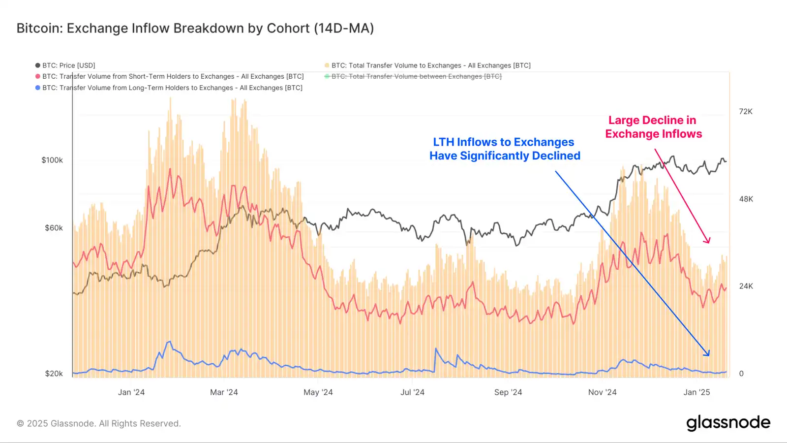
Centralized exchanges remain the primary venue for speculation and trading, handling billions of dollars in daily capital flows. Exchange inflows have declined significantly from a peak of $6.1 billion to $2.8 billion (-54%), highlighting the substantial reduction in speculative activity recently.
Notably, the capital inflow of LTHs to exchanges has decreased from $526.9 million in December to the current $92.3 million, a decline of -83% in deposit volume.
This further supports the argument that long-term investors may have completed a significant amount of profit-taking within this price range.
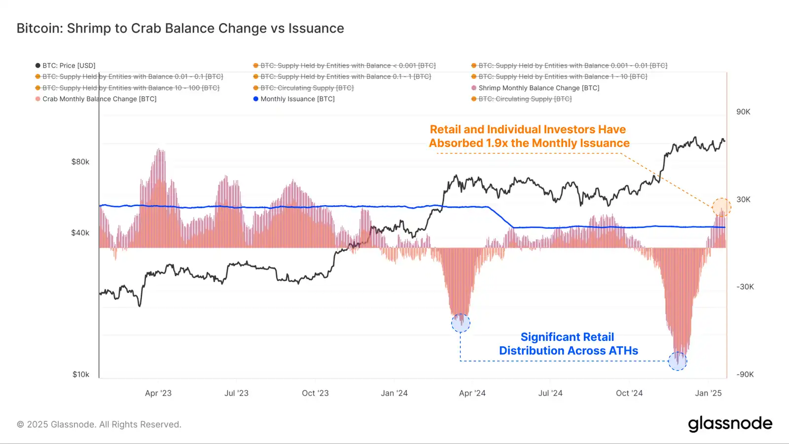
To further analyze the supply-demand balance, we can compare the rate of balance changes across different groups and standardize them to the BTC mining output. This provides a relative measure compared to the theoretical absorption of new issuance by each group.
Representing retail and individual investors, the shrimp group (holding <10 BTC) has absorbed approximately +25.6k BTC over the past month. In comparison, miners are issuing around +13.6k BTC per month.
Therefore, these retail and individual holders are actually absorbing 1.9 times the new supply entering the market through primary production.
Coiling Volatility
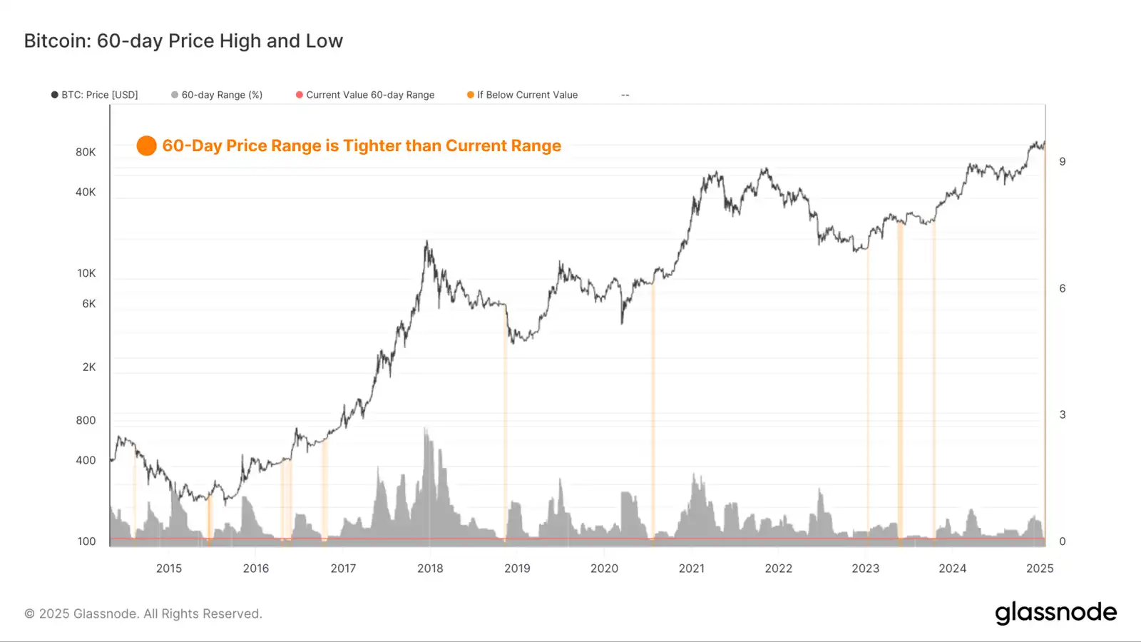
It is evident that the two on-chain models exhibit a strong convergence with the historically narrower 60-day price range, allowing investors to position themselves for an impending increase in volatility.
By measuring the percentage range between the highest and lowest prices over the past 60 days, we can see how market volatility has changed over time. The chart below highlights periods where the 60-day price range was narrower than the current trading range. All of these instances occurred just before a significant spike in volatility, mostly at the beginning of a bull market or late in a bear market cycle before a selloff.
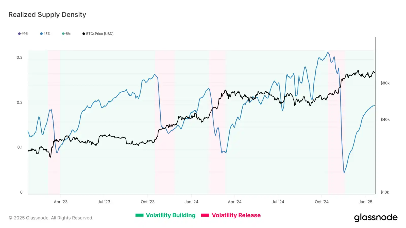
The prolonged sideways price action within a narrow range allows a large portion of the circulating supply to be redistributed and concentrated at relatively higher cost bases.
The Realized Supply Density metric quantifies the supply concentration within ±15% of the spot price. When supply is highly concentrated around the spot price, small price fluctuations can significantly impact investor profitability, further exacerbating market volatility.
After the peak in Bitcoin price in December, it began consolidating, forming a dense supply concentration with the cost basis close to the spot price. Currently, 20% of the supply is within ±15% of the spot price.
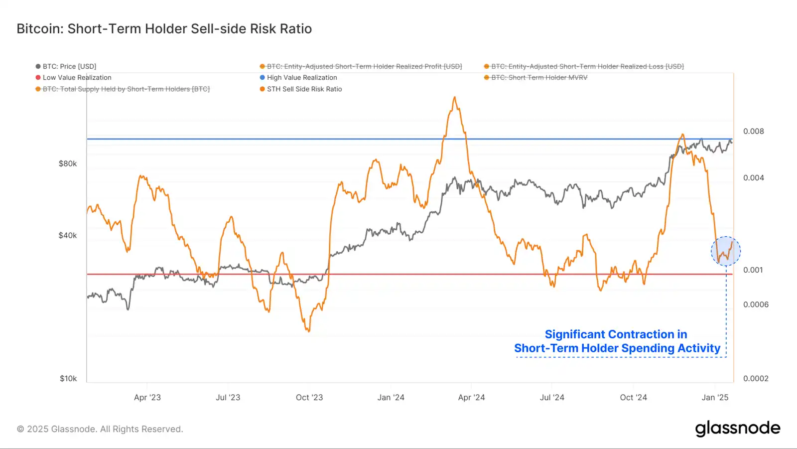
The Spent Output Profit Ratio (SOPR) describes this phenomenon from a different angle. This metric assesses the proportion of realized profits and losses relative to the asset's size (measured by realized market value). We can consider this metric within the following framework:
· High values indicate that when investors spend their tokens, the profit or loss relative to their cost basis is significant. This suggests the market may need to find a new equilibrium and often precedes high-volatility price movements.
· Low values indicate that most token spending is relatively close to their break-even cost basis, suggesting a certain degree of balance has been reached. This typically describes a low-volatility environment where the "profits and losses" within the current price range have been exhausted.
In recent weeks, the spending activity of short-term holders has contracted significantly, leading to a sharp decline in selling pressure. This often indicates that all the profit-taking and loss-realizing events planned by investors have now been executed. It tends to suggest the market is approaching a local equilibrium, which can be a precursor to the next wave of volatility.
Summary
The price of BTC experienced violent intraday swings, first spiking to a new high of $109,000, then plummeting, before stabilizing above $100,000. The macroeconomic backdrop around the US presidential inauguration is fraught with challenges and uncertainty, exacerbating the market's indecision.
In this article, we assess and analyze the conditions preceding the explosive yet erratic price movements. We propose a framework to identify the signs of impending volatility by looking at the reduction in on-chain transaction volume and capital flows, as well as the tightening of the price range.
Welcome to join the official BlockBeats community:
Telegram subscription group: https://t.me/theblockbeats
Telegram discussion group: https://t.me/BlockBeats_App
Twitter official account: https://twitter.com/BlockBeatsAsia


